Clinical psychologist Sharon Agam wanted to establish an authentic brand identity that would represent her unique approach to therapy and healing.
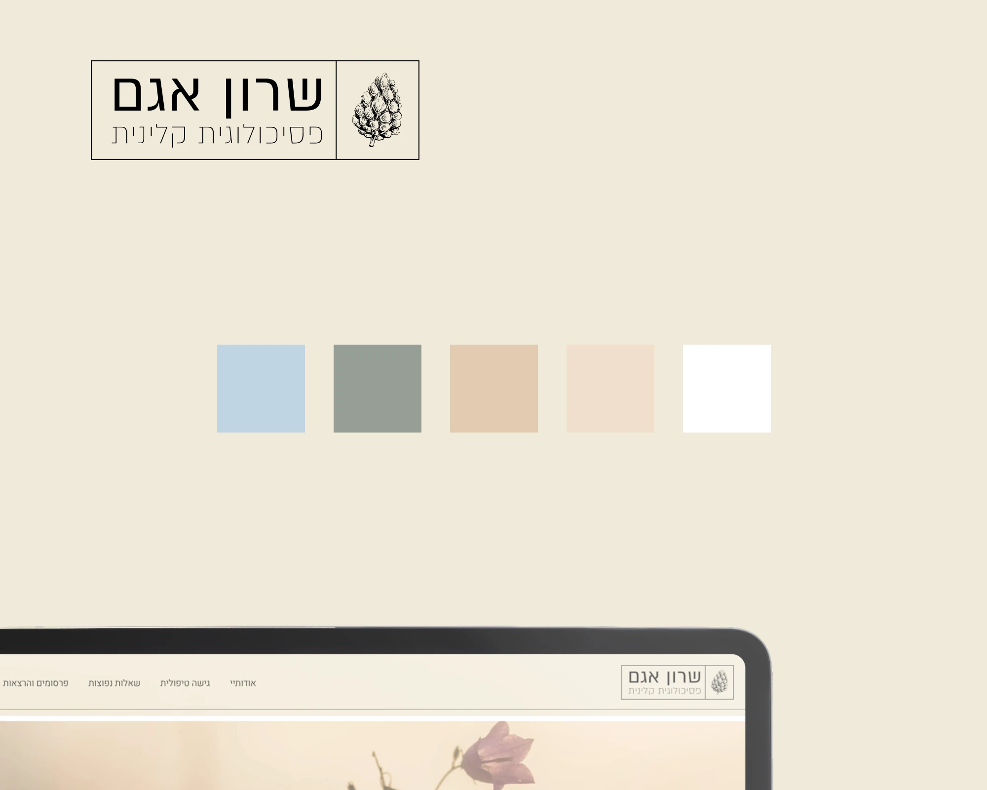
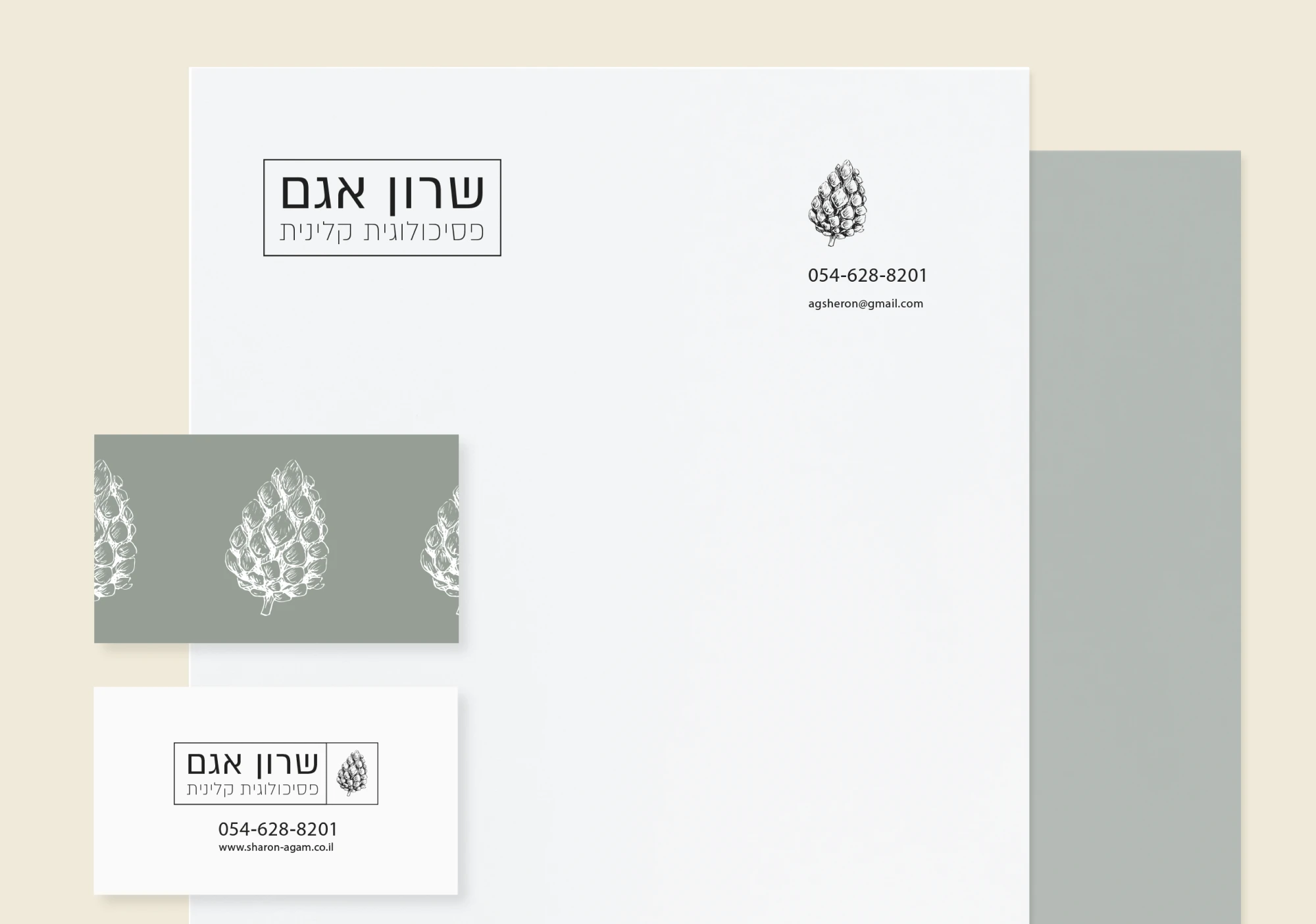
The logo captures the essence of the brand, blending the wisdom of nature with the clinical world. The focal point of the logo is an illustration of a conifer cone, which symbolizes growth, resilience, and the natural cycles of life. It reflects Sharon’s belief in people’s inherent strengths and their ability to adapt and heal.
The color palette contrasts subtle hues like light blue and white with earthy colors. The light blue and white are reminiscent of the sky, representing unlimited potential. They align with the clinic’s belief in the transformative nature of therapy and the patient’s power to change their life.
The earthy tones of gray and red ochre add balance with rock, mountain, and sand-like colors. They evoke a sense of strength, endurance and connection to the natural world outside the clinic.